Color isn’t just a visual element in web design; it’s a powerful tool that influences how users perceive and interact with a brand. From establishing brand identity to guiding user behavior, the strategic use of color can significantly impact a website’s effectiveness.
Understanding Color Psychology in Web Design
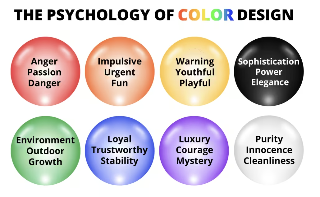
Color psychology examines how different hues affect human emotions and behaviors. In web design, this means selecting colors that align with the brand’s message and resonate with the target audience.
- Red: Conveys urgency and excitement; often used for sales and call-to-action buttons.
- Blue: Represents trust and professionalism; commonly seen in corporate and healthcare websites.
- Green: Associated with growth and tranquility; popular among eco-friendly and wellness brands.
- Yellow: Symbolizes optimism and energy; used to grab attention and stimulate mental activity.
Understanding these associations helps designers create emotional connections with users, enhancing engagement and retention.
Color’s Role in Brand Identity
Consistent color usage across a brand’s digital presence reinforces recognition and trust. A study by the University of Loyola, Maryland, found that color increases brand recognition by up to 80% (linkedin.com).
For instance, Coca-Cola’s iconic red or Facebook’s signature blue are instantly recognizable, demonstrating how color becomes synonymous with brand identity.
Enhancing User Experience Through Color
Beyond aesthetics, color influences user behavior and navigation. Effective color schemes can guide users’ attention to key elements, such as call-to-action buttons, and improve readability.
- Contrast: Ensures text stands out against backgrounds, enhancing readability.
- Hierarchy: Uses color to differentiate between primary and secondary actions, aiding navigation.
- Feedback: Employs color changes to indicate interactions, like hover effects or form validations.
These techniques contribute to a seamless and intuitive user experience, encouraging users to stay longer and engage more deeply with the content.
Choosing Effective Color Schemes for Websites
Selecting the right color palette involves understanding the brand’s values, target audience, and cultural context. Tools like Adobe Color or Coolors can assist in creating harmonious color schemes.
Considerations include:
- Brand Personality: Align colors with the brand’s character—bold colors for energetic brands, muted tones for sophistication.
- Audience Preferences: Research demographic color preferences to ensure appeal.
- Accessibility: Ensure sufficient contrast for readability and consider color-blind users by using patterns or labels in addition to color cues.
Implementing these strategies ensures the website is both visually appealing and user-friendly.
Real-World Examples
- Spotify: Utilizes a vibrant green to convey energy and creativity, aligning with its dynamic music platform.
- Dropbox: Employs a calming blue palette to communicate reliability and professionalism.
- Airbnb: Uses a soft pinkish-red to evoke warmth and friendliness, reflecting its community-focused brand.
These examples illustrate how thoughtful color choices reinforce brand messaging and enhance user experience.
Conclusion
Color is a fundamental aspect of web design that significantly influences brand perception and user interaction. By understanding color psychology, maintaining consistency, and considering user experience, designers can create compelling websites that resonate with users and strengthen brand identity.